
Hyper Square... Good Idea Perhaps? But Terrible Execution
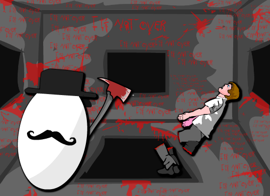
As we continue down the path of reviewing my old games we look at Hyper Square, this one always amuses me. The idea was solid but the execution was terrible. I watched a movie called Cube as a kid that was amazing, it was these people trapped inside a giant death rubix cube filled with traps. I thought what if I made that into a 2D game? so I did.
The Gameplay
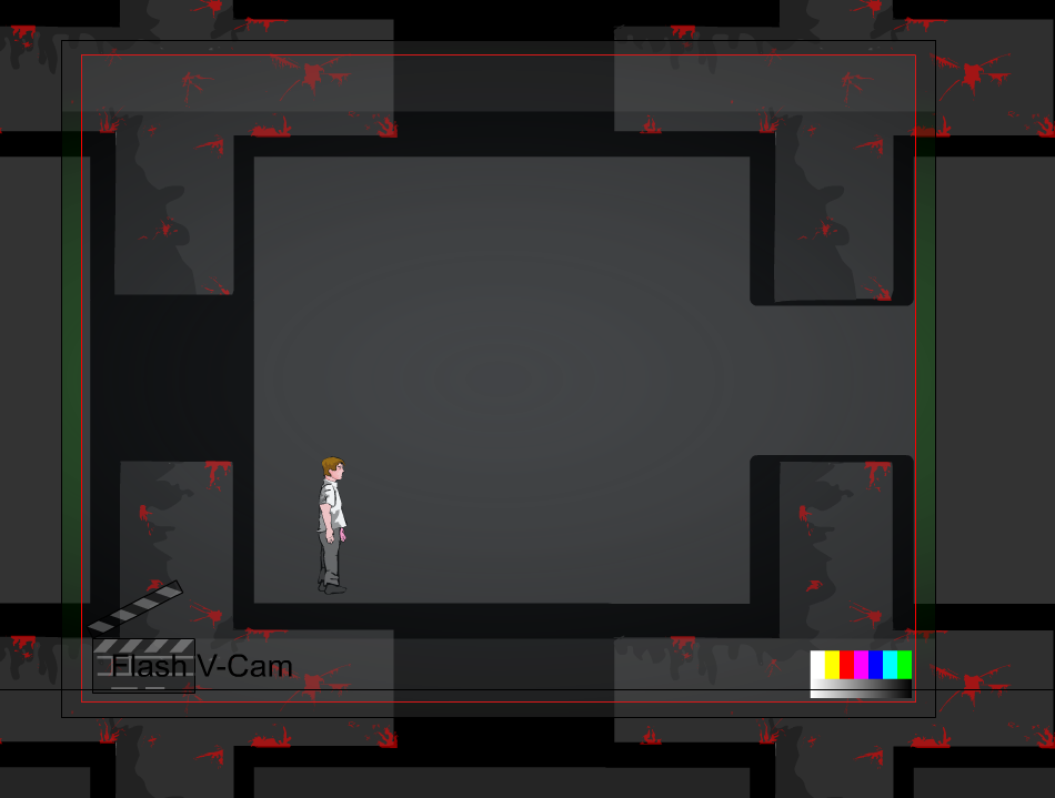
Interestingly for this game there was a lot of challenges to get past in Flash. The first was the fact that I wanted the entire level to rotate, which wasn't too bad in itself, but it caused a lot of glitches with the camera and player. So I used an old Flash plugin called Vcam. I then rotated the entire level around the player 90 degrees while he stuck in mid air to avoid collisions. The result was a game where you could keep rotating the level 4 ways, meaning there was technically 4 grounds.
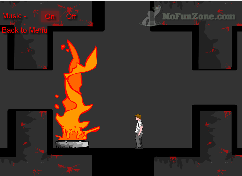
The idea from here could have been great, however since I was young, new and lazy I didn't add much scenery and this is where I failed. If I added a lot more identifying objects around the map it would have given the players something to go off and actually piece together. Without this and a background the game idea end up feeling hollow.
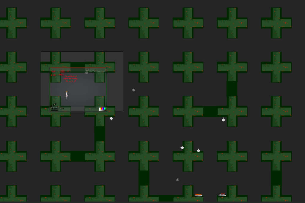
The other interesting part of this game is because it's always in squares. I made the camera shift one square over every time you got to it. It's an effect I have never used again, but I really want to take this idea and expand on it for a future game. It's a good way of moving the camera to always give a gridlocked feeling to the player.
Main Menu
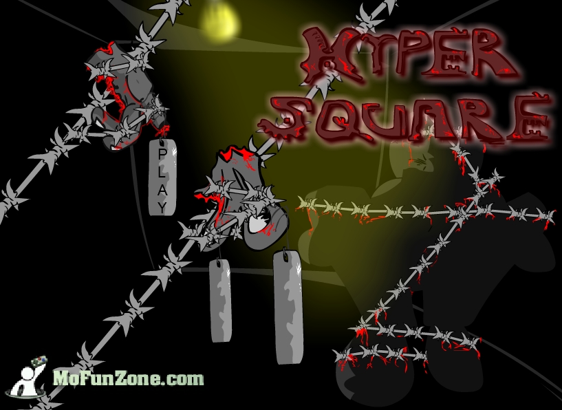
As always I'm a big fan of making main menu's. It's kinda funny when you look back on an old game you made and think, wow the menu is the best part of it! that's a little sad! :D
It's worth opening the Flash game just to see my epic spikes come flying in that I timed with the music. It's quite satisfying. So something to take from here and re-use is the barbed wire and the hanging menu items off the wire. This could potentially be redone with actual physics if I did a remake.
Getting Lost Was Bad
The main issue in this game was the levels got so big evetually the player is just running blind and rotating the level having no clue where to go. Unless you have an incredible memory using the traps as reference points, you are going to have a bad gameplay experience. However I still like to use this game as a good pivotal point in my career on where I went wrong and I made sure never to repeat these mistakes again in my future games.
Making bad games is good for learning, it really teaches you things you should never repeat. These are important ground rules to learn while you are young and you adopt a basic sense of game design from that point on.
The Traps!
I think the most interesting part of this game in the end was making the traps. There had to be a death animation for every one, so we have a guy burning to death in fire, frozen by ice, melted by acid and sliced in half. Probably the best thing about the game was these hand frame by frame animations. They could definitely be used in the future if they were touched up a lot.
Summary
It's not a good gameplay experience. However I like to leave it on my site to show how much I've grown since these terrible games, and potentially this idea could be remade in Unity as a fully fledged 3d version to honour the movies.
The only way to escape the square is to just close the game....